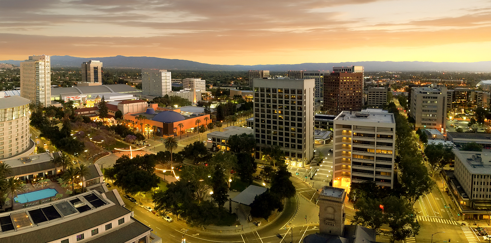
As summer draws closer and the weather gets warmer, more home and business owners in the Bay Area are thinking about their exterior and interior paint—and how to freshen, brighten or embolden their existing color schemes for 2022 and beyond. At Gruber Painting, we love to keep tabs on the latest trends and newest fashions, as well as the underlying psychological and emotional currents that inspire them. Here are Gruber Painting’s staff picks for the five bold new home painting trends for summer 2022!
Dark Blues: “Having the blues” can be a good thing!
In Western color psychology, blue has a plethora of different meanings, including peace, loyalty, trust, faith, and grace. Dark blues like Yale, Prussian, and denim blue enhance these qualities and add a little touch of mystery as well. These colors are most often used as main body colors for the exterior of the home alongside brilliant white trim, creating a stunning contrast that manages to be both conservative and stylish.
Chalky or Gray Greens: Fading into the background isn’t always a drawback!
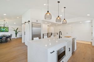
Shades of green like seafoam, sage, and mint are in fashion this year because of their links to nature, health, growth, healing, and vitality. Their resurgent popularity can be partially traced to the shift in thinking about COVID-19 from an ongoing national health emergency to an endemic state, signaling a return to what most people consider normal life. However, these shades and others in their general color scheme are also making a comeback among those who want to incorporate the soothing feel of getting back to nature into their home or work environment. As an interior color scheme, these shades and tones work to create a soft and subtle feel that conveys the use of color without distracting from other design elements, allowing artwork, trim or architectural features to take center stage.
Optimistic Shades: Always look on the bright side!
The last couple of years has brought more than the usual share of bad news. As people look to redecorate and revitalize both their living spaces and their spirits, bright, cheerful shades like sunflower and bumblebee yellow, or pearl and alabaster white, have experienced a surge in popularity. Yellow hues symbolize optimism, happiness, and energy, while white is associated with purity, innocence, elegance, and timelessness. Utilized in accent situations, louder colors are being applied to boldly express colors in small spaces or to create an instant focal point in larger areas.
Earth Tones: What can brown do for you?
Shades of brown are generally considered neutral colors with strong psychological links to the earth, soil, permanence, and stability. Tones like cinnamon, russet, tortilla, brunette, and beige are perennial top sellers in the legal profession, logistics, and construction, but they’re gaining in popularity among private homeowners as well because of their emotional associations—or lack thereof. These hues and tints can be used to create inviting spaces while still maintaining a strong, stable, “down to earth” feel.
Cool Feeling Shades: Chill out and enjoy!
Sometimes the shade, rather than the actual color, is what matters. Gray is often associated with mystery, restraint, neutrality, or balance. Cool shades such as seal, pewter, shadow, steel, and charcoal gray can be used to produce a sophisticated appearance for both interior and exterior applications. For exteriors, cool shades can be used to highlight or emphasize warmer or brighter colors. As an interior treatment, they work to double as a neutral backdrop or accompaniment for artwork, sculpture, accent walls, or anything else you may want to emphasize as the focal point of a space with just a little extra panache.
Two things to keep in mind about these color associations: First, because they are based on Western color psychology, they may not necessarily apply to those with a non-Western cultural heritage. For example, in Chinese culture, death and mourning are commonly associated with both black and white, while bright yellow denotes royalty, neutrality, and good fortune. Second, there is a vast vocabulary of color, encompassing every possible tint, tone, hue, and shade. Each of these carries its own associations, psychological resonance, and overall “feel” which may impact how you and your guests, visitors, employees, or customers experience the space and the people who live or work there in unexpected ways.
When you’re considering a new color scheme for your home or business, whether you’re looking to keep in step with the latest trends or set one of your own, Gruber Painting is here to help!
The perfect paint colors will make your space and world a more beautiful place that better reflects your unique personality, while our skilled, professional painting crews have the knowledge and equipment to tackle even the biggest paint jobs out there. To find out more, email us at info@gruberpainting.com; call us at (650) 417-5323; or click here to schedule a free, no-obligation site walk and estimate today. Let Gruber Painting show you how fun, easy, and affordable getting the beautiful paint job you’ve been dreaming of can be!


